Wednesday 25 September 2013

Character Names for your Story

Choosing a character name for your novel is as pressure-filled as picking a name for a baby. It has to suit the character’s personality, makes sense for the era and, most important, be super awesome. Names like Harry Potter, Holden Caulfield, and Stephanie Plum are memorable not just because of the amazing stories they navigate, but also because these names “fit” those characters so well. You need a name that “fits” your character too.

I stumbled upon these seven great rules for choosing character names offered up by popular mystery writer Elizabeth Sims (the Rita Farmer Mysteries). When developing characters—no matter what sort of characters you’re pursuing—heed common sense and consider each of these tips before choosing a name.

1. Check root meanings.
It’s better to call a character Caleb, which means “faithful” or “faithful dog,” than to overkill it by naming him Loyal or Goodman—unless you want that for comic/ironic purposes. Some readers will know the name’s root meaning, but those who don’t might sense it.

2. Get your era right.
If you need a name for an 18-year-old shopgirl in a corset store in 1930s Atlanta, you know enough not to choose Sierra or Courtney, unless such an unusual name is part of your story. Browse for names in the era you’re writing. A Depression-era shopgirl who needs a quick name could go by Myrtle or Jane; it will feel right to the reader. Small public libraries will often have decades’ worth of local high school yearbooks on the shelves. Those things are gold for finding name combinations from the proper era.

3. Speak them out loud.
Your novel might become an audiobook or an e-book with text-to-speech enabled. A perfectly good name on paper, such as Adam Messina, may sound unclear aloud: Adam Essina? Adah Messina?

4. Manage your crew appropriately.
Distinguish your large cast of characters by using different first initials, of course, and vary your number of syllables and places of emphasis. Grace Metalious (a great name right there) demonstrates this in her blockbuster Peyton Place, as do any of the successful epic writers like James Michener and Larry McMurtry.

5. Use alliterative initials.
Employ this strategy to call special attention to a character: Daniel Deronda, Bilbo Baggins, Ratso Rizzo, Severus Snape.

6. Think it through.
You might notice that in most crime fiction the murderer rarely has a middle name or initial. Why? Because the more you explicate the name, the more likely there’s a real person out there with it. And reading your story they might become upset and try to sue you or come after you some night with a bayonet.

7. Check ’em again.
When writing my novel The Actress, I needed a name for a Japanese-American criminal defense attorney, and the name Gary Kwan burst upon me. I loved the name and used it in the book. Only thing was, as soon as the thousands of copies of hardcovers were printed and shipped to stores, I heard from a reader who pointed out the simple fact that Kwan is a Chinese surname. I cursed loudly and decided: a) that I would ALWAYS check name origins, and b) that Gary Kwan had a Chinese grandfather who adopted a Japanese orphan who became Gary’s father. Or something like that.

Naming characters just right is a challenge, but give it some time and thought, and you’ll start to find the fun in it. Study the names great authors have come up with, let your mind loose to play, do your research, and above all, trust your ear.

And if worst comes to worst, here’s hoping you’re like Oates and lucky enough to just bump into your character in a dream—where you can ask him yourself.
-Author Elizabeth Sims
Monday 23 September 2013

Book Design and Page Layout Software for first time Author's

Your going to write a book?  Its really a empty page many people stare at for days wondering what to do.  

First step is to pick the format tools that your utilising.  

With the age of the computer, many people will put the typewriting skills to work for them on a mission to write a book once in their life?

This is the first step for many people to start.....

Good luck, see you on the inside after YOUR first book is complete.

Guide to Book Design & Page Layout Software

There are three levels of software generally available to you if you decide to go the do-it-yourself (DIY) route:
  1. Word processorsMicrosoft Word has long had a chokehold on the word processing market due to its complete domination of the corporate environment. And don’t forget all those PCs that came with MS Office pre-installed on them.

    Most people use Word, and we also have the useful open source Open Office that reads and writes Word files, too. Other choices in this range include Apple’s PagesStoryist and Scrivener, word processors that are also story development tools; Word Perfect, the old PC warhorse still in production, and a host of others. These are the programs writers are most familiar with, and in which you’ve probably spent the last couple of years writing your book.
  2. Layout programs—Since the advent of “desktop publishing” programs have been available that perform the functions usually taken care of by a layout artist.

    Now we have programs like Adobe InDesign and Quark Xpress to perform these functions. They allow you to bring together all the parts of a publication and manipulate them, then output the resulting job to a variety of devices for reproduction.
  3. Hybrids—There is also a midrange type of software that attempts to combine the word processing functions with layout functions. For instance,Microsoft Publisher is popular for flyers, business brochures and similar projects, and there are a lot of templates available to make creating jobs easier.

    Likewise, Apple’s Pages is really a hybrid and can be used either as a word processor or as a layout engine, depending on the type of document you create. This category is showing the most growth in recent months, with more programs coming onto the market that attempt to be “all things to all people.”
    Now Pages offers EPUB output, as does Storyist. Any program that provides a clean word processing environment as well as the ability to combine text, graphics and output to reproduction devices might fall into this category.

Which Option is Right For You?

It’s pretty seductive to use your word processor for putting your book together. After all, you’re already familiar with the program and that should save you a ton of time. But a word processor is a poor choice for some kinds of books:
  • Illustrated books—It can be very frustrating to try to position graphics with any precision in a word processor. These programs usually lack sophisticated color-handling also, limiting their use for illustrated books.
  • Heavily formatted books—The more formatting involved, like sidebars, pull quotes, tables, charts, illustrations and anchored graphics, the less appropriate a word processor is as a layout solution.
  • Typographically sophisticated books—Word processors do not have the very fine typographic controls you find in sophisticated layout programs. And hyphenation and justification of text simply will not look as polished as it would in dedicated software.

Pros and Cons for Each Type of Software

No matter what you choose to use as a vehicle to publish your book, there are tradeoffs. They are not always apparent, and might not affect you from day one of your project, but before you lock yourself into one solution or another, consider these:
  • Word processors, Pro and Con
    • Pro: You already know how to use it
    • Pro: The least expensive of the three alternatives, particularly if you already own it.
    • Pro: The shortest learning curve of the three types of programs
    • Con: You may not know how to use the functions you’ll need to do your book.
    • Con: Get ready to be frustrated if you’re trying to do exact placement of images on your pages
    • Con: Your options to output your pages may be severely limited, and you’ll have no support for color corrections, color calibration or many other advanced functions needed for some kinds of books.
  • Hybrids, Pro and Con
    • Pro: Less expensive than dedicated layout programs.
    • Pro: Easier to learn than dedicated layout programs.
    • Pro: Pre-built templates are available to get you started.
    • Con: Compromised functions of both word processors and layout programs may fail to satisfy or give the range of options of either type of program separately.
    • Con: Idiosyncratic. These programs may use “dumbed down” functions and language to describe the processes in an attempt to appeal to the widest variety of users.
    • Con: You may be frustrated by the availability of some, but not all, the functions of a higher-level layout program.
  • Layout programs, Pro and Con
    • Pro: You get complete control of your pages, with precise placement of all elements.
    • Pro: Robust support for output to all kinds of reproduction devices from low-end to high-end reproduction
    • Pro: Huge market of add-on and supplemental programs that supply even more functionality to these programs, and integrate with image editing functions as well.
    • Con: These babies are expensive to buy, and if you will only do one book, it may be hard to justify the expense.
    • Con: If you haven’t used this type of software before, get ready for some intensive training. And you can start by trying to figure out what a “pica” is.
    • Con: The variety and precision of commands and functions can be overwhelming for new users.

Recommendations

What kind of software you end up using to do your book will rely on lots of factors. But generally speaking, I would recommend:
  • Word processors if you’re on a budget, if your book is basically running text without much formatting, or if you only want to print up a few books for private use. You can dedicate yourself to learning how to manipulate these programs into producing a decent-looking book, but it may not be the best use of your time. Microsoft Word remains my choice here.
  • Hybrid programs if you’re willing to pay a few dollars for software that will give you a lot more flexibility with page layout, effects, placement of non-text elements. And if you are only a casual user, these programs will be easier to learn. I’m impressed with Apple’s Pages for layout and output to EPUB.
  • Page layout programs if you foresee doing more than one book a year, you like the idea of learning printing terms and procedures, or if you want to have complete control of an illustrated or heavily-formatted book. Keep in mind that the first books you produce will still look like first efforts. Plan to devote time to learning the software with some kind of training before diving into your project. Standards here include Adobe InDesign and Quark Xpress.

Sunday 22 September 2013

5 Favorite Fonts for Interior Book Design

5 Favorite Fonts for Interior Book Design

Aljen Publishing House

   
When you start to create books, your story is coming alive line after line.
I love to skim through my research constantly.  I utilise fonts that are friendly on my eyes.  However there are 5 Fonts that can make that decision easier if you are writing in a certain period than these fonts  could be a great suggestion
There’s no bigger decision you make in designing a book than picking the body typeface. A book by its nature is a long reading experience, and as book publishers we want our books to be as easy to read as possible while communicating the author’s intent. Style and fashion also play their part in many book designs, particularly in popular niches. The accumulated expectations of 500 years of book readers also come into play. Books are pretty conventional objects, after all.
Some fonts really lend themselves to book design while others, which look good in a brochure or on a business card or billboard, make odd, unreadable books. Any idiosyncrasy in the type design will be magnified by the repetition of typesetting 75,000 or 100,000 words in thousands of lines on hundreds of pages.
So the choice of your basic typeface looms large when you sit down to design your book. Here are five typefaces that have become favorites and which will almost always look great in your books too. You’ll find links to the vendor of the fonts as well.
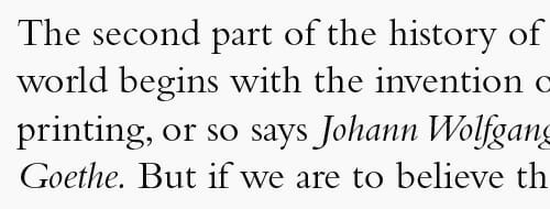
  1. Garamond – Named after the famed 16th-century French “punch-cutter” or type designer Claude Garamond, many versions of this old style face exist. The one used most frequently now is the version designed by Robert Slimbach for Adobe. It’s known for its graceful, flowing style and humanistic elegance. Here’s a sample:
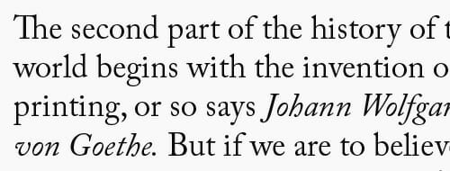
  2. Janson – Designed by the Hungarian Nicholas Kis in the 17th century, the design was mistakenly attributed to the Dutch printer Anton Janson. It is a strong and elegant face with marked contrast between thin and thick strokes, and may be the most popular text face for fine bookmaking. Here’s a sample:
  3. Bembo – Bembo, another old style typeface, was based upon a design by Francesco Griffo, who worked for famed early printer and publisher Aldus Manutius in Venice in the 15th and early 16th century. It was a clear attempt to bring the humanist script of the finest scribes of the day to the printed page, and served as the chief inspiration to Claude Garamond, among others. Bembo has a classic beauty and readability that are unmatched.
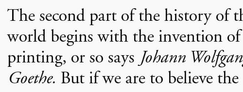
  4. Caslon – One of the most popular text typefaces of the 18th and 19th centuries, Caslon was designed by William Caslon in England in the early 18th century. An old-style face modeled on early Dutch originals, Caslon has an appealing irregularity and creates a distinctive texture on the page. Many people recognize Caslon from its extensive use in textbooks. Here’s a sample:
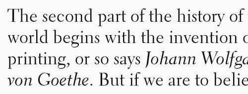
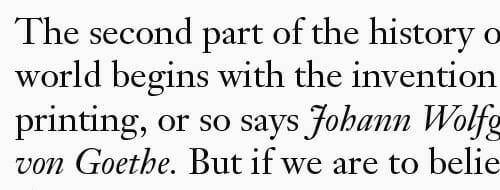
  5. Electra – A 1935 design by the prolific type designer D.W. Dwiggins, Electra creates a distinctive “color” and evenness on a printed page. It’s inventor said he wanted Electra to excel at setting down warm human ideas, to endow it with a warmth of blood and personality. Here’s a sample:
  6. Get Electra here
    book-design-type-sample-electra
    Although it would be easy to fill a book with samples of great text typefaces, it’s also true that many professional book designers could, if necessary, limit themselves to just these five fonts and continue to create great—and greatly varied—book designs, for years to come.
    So when it comes time to select the typeface for your next book, choose one of these five and rest assured that you have made a great selection.
    Those are my favorites. What about yours?